Infographic Designer Visuals in
Power BI
Power BI offers great visuals by default,
The infographic designer visual is useful for presentations and
to have a slicker report or dashboard. The infographic designer's visuals allow
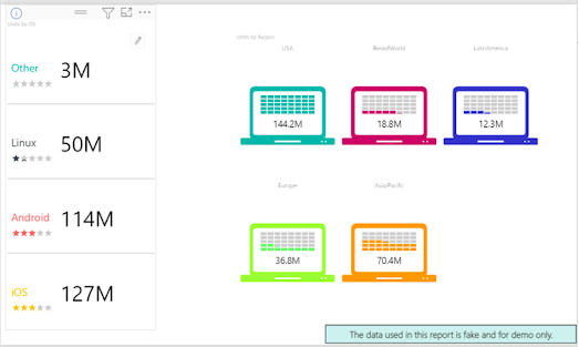
you to create eports with infographic icons like this one:

Or this one:
Requirements
Power BI Desktop installed.
Either SQL Server installed and the AdventureworksDW database
installed or use other tables and other sources with similar information e.g.
Excel.
I will use the AdventureworksDW2019, but you can use lower
versions as well.
For the examples. I will use the product information and the
standard cost columns from the DimProduct table of the AdventureworksDW
database.
. This visual is not installed by default. T install it, in
Visualizations, select the Get more visuals option.

You will see several visuals, most of which were created by
Microsoft. You will see: advanced cards, timeline slicers, tornado charts,
radar charts, histogram charts, and more. Choose the Infographic Designer.

Read the Overview to understand the visual and press the Download
Sample button. This button will download a Power
BI project with
some interesting examples of this visual.

Open the project and check out of the pages of reports. The
following images provide some ideas for the reports that you can do in Power BI
with this visual.


Use the Infographic
Designer Visuals in your Report
I will use using the dbo.DimProduct table for the report, or you
can use a similar table.


click the Infographic Designer visual.
Include the EnglishProductName column and the StandardCost in
the report.

Apply a filter to reduce the number of products in the chart.
Apply a filter in the product name.
Select some product names: All-Purpose Bike, AWC Logo Cap, and
Bike Wash – Dissolver.

In addition, in the report click the Edit mark icon.

Select a shape for the report.

Use the Infographic
Designer Visuals – Shapes Available
There are several shapes available. Basic shapes like squares,
circles, stars, crosses, etc.

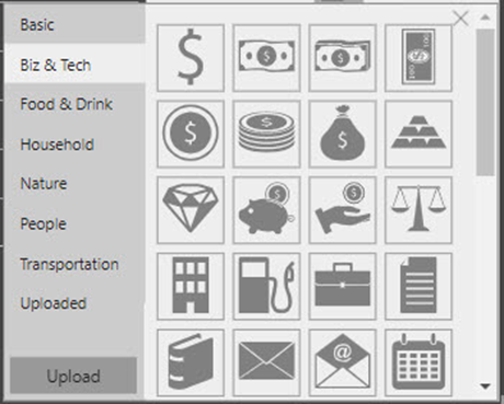 Biz
& Tech Shapes
Biz
& Tech ShapesUse the Transportation category and use the bikes because the Adventureworks
products are bikes. There are several other categories and you can add your own
custom shapes.

, you can use multiple units in the report.

Optionally press the Visual Settings icon to
modify the colors of your shape.

Select a color for your chart. Instead of using column charts,
we will use bikes.

We can create our own shapes based on images..
Create Your Own Shapes
With the upload option, you can add your own shapes to the
infographic designer.
Press the upload button.

Look for an SVG file (which is a Scalable Vector Graphics and a web-friendly
format).

If you do not have an SVG file, then look in Google for SVG for the name of the shape.
Or use a converter site like convertio.co to convert a
file from jpg to SVG.
In addition, you can convert png, or jpeg to SVG, and once
converted you can download it.

Power BI offers great visuals by default, but, if these are not
enough then, you can also go to the gallery and get new ones there or you can
include those in a file.


No comments:
Post a Comment
if you have any doubts, please tell me